QCustomDataTable
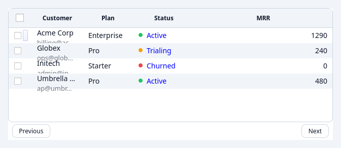
QCustomDataTable is a modern, tokenized data grid built on Qt's model/view
framework. It takes a list of row dictionaries and column descriptors and gives
you client-side sorting, filtering, pagination, and selection out
of the box — styled entirely from the design tokens.
Need virtualization for 100k+ rows, frozen columns, inline editing, grouping / pivot, server-side data, or CSV/Excel export? Those live in QCustomDataTablePro — the same API, extended.
Overview
- Model/view grid backed by a list of
dictrows + column descriptors. - Client-side sort (by real value, not the display string), substring filter, and pagination.
- Selection — none / single row / multi row / cell.
- Fully tokenized (
variant+sizeVariant); follows the active theme. - Signals for selection, clicks, sorting, and paging.
Quick start
from qtpy.QtWidgets import QApplication
from Custom_Widgets.QCustomDataTable import QCustomDataTable, DataTableColumn
from Custom_Widgets.JSonStyles.tokens import DesignTokens, applyDesignTokens

app = QApplication([])
applyDesignTokens(app, tokens=DesignTokens(theme="light"))

table = QCustomDataTable()
table.setColumns([
    DataTableColumn("name",  "Name",  type="text"),
    DataTableColumn("price", "Price", type="number"),
    DataTableColumn("active", "Active", type="bool"),
])
table.setData([
    {"name": "Widget A", "price": 19.99, "active": True},
    {"name": "Widget B", "price": 4.50,  "active": False},
])
table.resize(480, 320)
table.show()
app.exec()
Rows are plain dictionaries keyed by each column's key.
Columns
Describe columns with DataTableColumn (or a plain dict / bare key string —
both are coerced):
DataTableColumn(key, title=None, type="text", width=None,
                align=None, formatter=None, sortable=True)
| Field | Description |
|---|---|
key | The row-dict key this column reads. |
title | Header text (defaults to key). |
type | "text" | "number" | "date" | "bool" — drives default alignment and sort comparison. |
width | Column width in px, or None for automatic. |
align | A Qt.Alignment, or None for the type default. |
formatter | Optional callable(value) -> str for display. |
sortable | Whether the column may be sorted. |
The raw (unformatted) value drives sorting and filtering, so a number column
sorts numerically even when a formatter shows "$19.99".
Data
| Method | Description |
|---|---|
setColumns(columns) | Set the column descriptors. |
setData(rows) | Replace all rows (list of dicts). |
addRow(row) | Append a row. |
clear() | Remove all rows. |
model() / view() | The underlying model / QTableView. |
Sorting, filtering, pagination
from qtpy.QtCore import Qt
table.sortBy(1, Qt.DescendingOrder)   # sort by column index
table.setFilterText("widget")         # case-insensitive substring across columns
Pagination is on by default; drive it in code or let users click Prev/Next:
| Method / property | Description |
|---|---|
pageSize (property) | Rows per page (0 disables paging). |
showPagination (property) | Show the Prev/Next footer. |
pageCount() / currentPage() | Paging state. |
setPage(i) / nextPage() / prevPage() | Navigate. |
Selection
from Custom_Widgets.QCustomDataTable import QCustomDataTable
table.selectionMode = QCustomDataTable.SelectionMode.MultiRow
rows = table.selectedRows()           # source-model row indices
SelectionMode: NoSelection · SingleRow · MultiRow · Cell.
Signals
| Signal | Description |
|---|---|
rowSelected(int) | The current row changed (source-model index). |
cellClicked(int, int) | A cell was clicked (row, column). |
sortChanged(int, object) | Sort column / order changed. |
pageChanged(int) | The page changed. |
Properties (Designer)
pageSize · showPagination · selectionMode · sortable · filterable ·
alternatingRowColors · showGrid · showHeader · variant · sizeVariant.
Theming
Styled from the design tokens (datatable_qss) via applyDesignTokens. Use
variant (e.g. outline, ghost, primary) and sizeVariant (sm/md/lg)
for emphasis and density. See Theming.
Upgrading to Pro
QCustomDataTablePro subclasses this table through stable extension seams — your columns, data, sorting, and examples carry over unchanged. Swap the class, gain the features (virtualization, frozen columns, inline editing, grouping/pivot, server-side data, CSV/XLSX export).
API reference
Generated from the widget's live metaobject — do not edit by hand.
Properties
| Property | Type | Default |
|---|---|---|
pageSize | int | 25 |
showPagination | bool | — |
selectionMode | enum: NoSelection/SingleRow/MultiRow/Cell`` | SingleRow |
selectable | bool | — |
sortable | bool | — |
filterable | bool | — |
alternatingRowColors | bool | — |
showGrid | bool | — |
showHeader | bool | — |
variant | enum: primary/secondary/outline/ghost`` | outline |
sizeVariant | enum: sm/md/lg`` | md |
Signals
| Signal |
|---|
cellClicked(int,int) |
headerActionsGlyphClicked() |
pageChanged(int) |
rowActionTriggered(int,QString) |
rowSelected(int) |
selectionCheckedChanged(QVariantList) |
sortChanged(int,PyObject) |
Methods
| Method | Description |
|---|---|
addRow(row) | Add a row. |
alternatingRowColors(*args, **kwargs) | Alternating row colors. |
buildRowActionsMenu(srcRow) | A QMenu of the configured row actions; each entry emits |
cellClicked(...) | Cell clicked. |
checkedRows() | Sorted SOURCE-model row indices whose checkbox is ticked. |
clear() | Clear. |
clearChecked() | Clear the checked. |
currentPage() | Current page. |
customizeQCustomDataTable(**customValues) | Customize Q custom data table. |
delegate() | Delegate. |
eventFilter(obj, event) | Event filter. |
filterable(*args, **kwargs) | Filterable. |
headerActionsGlyphClicked(...) | Header actions glyph clicked. |
isSelectable() | Return whether the widget is selectable. |
model() | Model. |
nextPage() | Next page. |
pageChanged(...) | Page changed. |
pageCount() | Page count. |
pageSize(*args, **kwargs) | Page size. |
prevPage() | Prev page. |
rowActionTriggered(...) | Row action triggered. |
rowActions() | Row actions. |
rowSelected(...) | Row selected. |
selectable(*args, **kwargs) | Selectable. |
selectedRows() | Return the selected SOURCE-model row indices (sorted, unique). |
selectionCheckedChanged(...) | Selection checked changed. |
selectionMode(*args, **kwargs) | Selection mode. |
setActionsColor(color) | Colour of the kebab (⋮) glyph. |
setAllChecked(checked=True) | Set the all checked. |
setAutoFlex(on) | Enable/disable managed flex sizing. When off, columns keep their |
setCellAccentColor(color) | Colour used for link/status cell text (blank/None -> palette link). |
setCellMutedColor(color) | Colour used for the muted second line of twoline cells. |
setColumns(columns) | Set the columns. |
setData(rows) | Set the data. |
setFilterText(text) | Set the filter text. |
setFlexColumn(dataColumnIndex) | Choose which DATA column (0-based, ignoring the select column) fills |
setFlexMinWidth(px) | Floor width the flex column never shrinks below (table scrolls once |
setHeaderAccentColor(color) | Colour of the ACTIVE sort caret. |
setHeaderActionsGlyph(kind) | Glyph in the actions-column header, e.g. 'gear' (or None). Clicking |
setHeaderGlyphColor(color) | Muted colour for header carets / caret / gear (track the theme). |
setHeaderSelectCaret(on) | Show a dropdown caret next to the select-all checkbox. |
setPage(index) | Set the page. |
setPersistentSortIndicators(on) | Draw an up/down sort caret on EVERY sortable column header (web-style), |
setRowActions(actions) | Enable the trailing ⋮ column. actions is a list of (key, label) |
setRowChecked(row, checked=True) | Set the row checked. |
setRowSeparatorColor(color) | Draw a uniform 1px bottom border under EVERY cell (rich cells are |
setRows(rows) | Set the rows. |
setSelectable(on) | Show/hide the leading checkbox column (with a select-all header). |
setStatusDotSize(px) | Set the status dot size. |
setTwoLineSubtitleBold(bold) | Set the two line subtitle bold. |
setTwoLineSubtitleScale(delta) | Twoline subtitle size delta in points (0 = two equal peer lines). |
showGrid(*args, **kwargs) | Show the grid. |
showHeader(*args, **kwargs) | Show the header. |
showPagination(*args, **kwargs) | Show the pagination. |
sizeVariant(*args, **kwargs) | Size variant. |
sortBy(column, order=<SortOrder.AscendingOrder: 0>) | Sort by. |
sortChanged(...) | Sort changed. |
sortable(*args, **kwargs) | Sortable. |
variant(*args, **kwargs) | Variant. |
view() | View. |