QCustomTrendChip
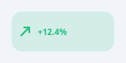
A directional delta / trend indicator.
A painted up/down/flat arrow that colour-codes a change (green up, red down, grey flat) with an optional value label. Three looks: variant="circle" (default) - just the arrow in a tinted circle (the classic income/expense chip); square, icon-only. variant="soft" - a rounded pill: tinted background + arrow + text. variant="plain" - arrow + text, no background. Direction is set explicitly or inferred from a numeric value's sign. The arrow is drawn with QPainter (no glyph font), so it is crisp and theme-tokenisable.
At a glance
| Tier | Free (GPLv3) |
| Import | from Custom_Widgets.QCustomTrendChip import QCustomTrendChip |
| Qt Designer | Yes — drag it from the palette |
Quick start
from Custom_Widgets.QCustomTrendChip import QCustomTrendChip

widget = QCustomTrendChip()
widget.setVariant("soft")
widget.setValue(12.4, "+12.4%")
That is the exact code behind the screenshot above.
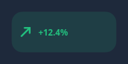
Dark theme
Colours come from the design tokens, so the widget follows the app theme with no extra work.
Properties
Every property below is settable in code and in Qt Designer.
| Property | Type | Default |
|---|---|---|
text | string | — |
direction | enum: up/down/flat`` | up |
variant | enum: circle/soft/plain`` | circle |
upColor | color | #22c07e |
downColor | color | #f2704e |
flatColor | color | #8b909e |
tintOpacity | float | 0.14 |
cornerRadius | int | 15 |
Methods
| Method | Description |
|---|---|
cornerRadius(*args, **kwargs) | Corner radius. |
direction(*args, **kwargs) | Direction. |
downColor(*args, **kwargs) | Down color. |
flatColor(*args, **kwargs) | Flat color. |
setDirection(direction) | Set the direction. |
setText(text) | Set the text. |
setValue(value, text=None) | Set direction from a number's sign; optionally format the label. |
setVariant(variant) | Set the variant. |
text(*args, **kwargs) | Text. |
tintOpacity(*args, **kwargs) | Tint opacity. |
upColor(*args, **kwargs) | Up color. |
variant(*args, **kwargs) | Variant. |
Related
QCustomAgendaList · QCustomAlert · QCustomAvatar · QCustomAvatarGroup · QCustomBadge · QCustomCard · QCustomChip · QCustomChipGroup