QCustomListRow
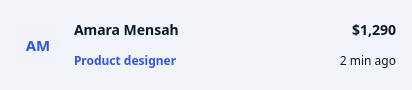
A leading-icon list item.
The universal "row" for transaction feeds, activity lists, leaderboards and notifications: a rounded icon/avatar chip, a title + subtitle stacked in the middle, and an optional trailing value + meta on the right. Composed from a layout + QLabels (not painted) so the text uses real fonts and can be themed by objectName/role QSS, while sensible inline defaults make it look right standalone. The leading chip takes either a QPixmap/QIcon (setIcon) or a letter/emoji (iconText). Set content in code or via the Designer properties.
At a glance
| Tier | Free (GPLv3) |
| Import | from Custom_Widgets.QCustomListRow import QCustomListRow |
| Qt Designer | Yes — drag it from the palette |
Quick start
from Custom_Widgets.QCustomListRow import QCustomListRow

widget = QCustomListRow()
widget.setIconText("AM")
widget.setTitle("Amara Mensah")
widget.setSubtitle("Product designer")
widget.setValue("$1,290")
widget.setMeta("2 min ago")
That is the exact code behind the screenshot above.
Dark theme
Colours come from the design tokens, so the widget follows the app theme with no extra work.

Properties
Every property below is settable in code and in Qt Designer.
| Property | Type | Default |
|---|---|---|
frameShape | QFrame::Shape | — |
frameShadow | QFrame::Shadow | — |
lineWidth | int | — |
midLineWidth | int | — |
frameWidth | int | — |
frameRect | QRect | — |
title | string | Starbucks |
subtitle | string | Shopping |
value | string | - $120.00 |
meta | string | 31 Mar 2019 |
iconText | string | — |
chipColor | color | #f1f3f8 |
chipTextColor | color | #3355e8 |
subtitleColor | color | #3355e8 |
valueColor | color | — |
chipSize | int | 44 |
chipRadius | int | 13 |
showDragHandle | bool | False |
dragHandleColor | color | #969baa |
Methods
| Method | Description |
|---|---|
chipColor(*args, **kwargs) | Chip color. |
chipRadius(*args, **kwargs) | Chip radius. |
chipSize(*args, **kwargs) | Chip size. |
chipTextColor(*args, **kwargs) | Chip text color. |
dragHandleColor(*args, **kwargs) | Drag handle color. |
iconText(*args, **kwargs) | Icon text. |
meta(*args, **kwargs) | Meta. |
setIcon(icon) | Leading chip image: a QPixmap or QIcon. Clears any iconText. |
setIconText(text) | Leading chip glyph/letter (e.g. an initial). Clears any pixmap. |
setMeta(text) | Set the meta. |
setSubtitle(text) | Set the subtitle. |
setTitle(text) | Set the title. |
setValue(text) | Set the value. |
showDragHandle(*args, **kwargs) | Show the drag handle. |
subtitle(*args, **kwargs) | Subtitle. |
subtitleColor(*args, **kwargs) | Subtitle color. |
title(*args, **kwargs) | Title. |
value(*args, **kwargs) | Value. |
valueColor(*args, **kwargs) | Value color. |
Related
QCustomAgendaList · QCustomAlert · QCustomAvatar · QCustomAvatarGroup · QCustomBadge · QCustomCard · QCustomChip · QCustomChipGroup