QCustomEmptyState
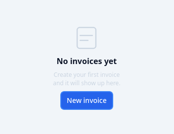
A centered "nothing here yet" placeholder.
A mark + title + description + an optional action button. Tokenized. Emits actionClicked.
The default mark is PAINTED, not a glyph. An emoji does not tint with the theme, does not scale cleanly, and renders as a different picture on every platform - the same reasoning as QCustomSparklesText's drawn star. setIcon() still accepts a string for anyone who wants one.
At a glance
| Tier | Free (GPLv3) |
| Import | from Custom_Widgets.QCustomEmptyState import QCustomEmptyState |
| Qt Designer | Yes — drag it from the palette |
Quick start
from Custom_Widgets.QCustomEmptyState import QCustomEmptyState

widget = QCustomEmptyState()
Dark theme
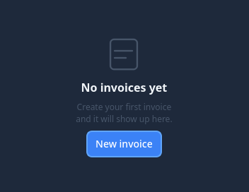
Colours come from the design tokens, so the widget follows the app theme with no extra work.
Properties
Every property below is settable in code and in Qt Designer.
| Property | Type | Default |
|---|---|---|
markSize | int | 56 |
markColor | color | #64748b |
Signals
| Signal |
|---|
actionClicked() |
Methods
| Method | Description |
|---|---|
actionButton() | Action button. |
actionClicked(...) | Action clicked. |
markColor(*args, **kwargs) | Mark color. |
markSize(*args, **kwargs) | Mark size. |
setActionText(text) | Set the action text. |
setDescription(description) | Set the description. |
setIcon(glyph_or_pixmap) | A string, a pixmap, or None to go back to the painted default. |
setTitle(title) | Set the title. |
Theming
Colours come from the design tokens, so they follow the active theme. Roles used: on-surface, on-surface-muted.
See Design tokens.
Related
QCustomAgendaList · QCustomAlert · QCustomAvatar · QCustomAvatarGroup · QCustomBadge · QCustomCard · QCustomChip · QCustomChipGroup