QCustomAvatar
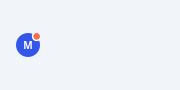
A single circular avatar with an optional status dot.
Shows either initials (text) or an image, clipped to a circle, over a solid
fill. An optional status / notification dot sits in a corner with a ring that
separates it from whatever is behind the avatar (set statusBorderColor to the
surface colour). An optional outer ring frames the whole avatar. Everything is
painted with QPainter so it stays crisp at any size and needs no children.
Emits clicked so it can act as a profile button.
(QCustomAvatarGroup already exists for a row of overlapping avatars; this is the single, status-aware building block.)
At a glance
| Tier | Free (GPLv3) |
| Import | from Custom_Widgets.QCustomAvatar import QCustomAvatar |
| Qt Designer | Yes — drag it from the palette |
Quick start
from Custom_Widgets.QCustomAvatar import QCustomAvatar

widget = QCustomAvatar()
Dark theme
Colours come from the design tokens, so the widget follows the app theme with no extra work.

Properties
Every property below is settable in code and in Qt Designer.
| Property | Type | Default |
|---|---|---|
text | string | M |
imageSource | string | — |
cornerRadius | int | -1 |
bgColor | color | #3355e8 |
textColor | color | #ffffff |
showStatus | bool | True |
statusColor | color | #f2704e |
statusPosition | enum: top-right/bottom-right/top-left/bottom-left`` | top-right |
statusBorderColor | color | #ffffff |
ringColor | color | #00000000 |
ringWidth | int | 0 |
Signals
| Signal |
|---|
clicked() |
Methods
| Method | Description |
|---|---|
bgColor(*args, **kwargs) | Bg color. |
clicked(...) | Clicked. |
cornerRadius(*args, **kwargs) | Corner radius. |
imageSource(*args, **kwargs) | Image source. |
ringColor(*args, **kwargs) | Ring color. |
ringWidth(*args, **kwargs) | Ring width. |
setBgColor(c) | Set the bg color. |
setImage(image) | Set the image. |
setImageSource(source) | Set the avatar image from a local PATH or an http(s) URL — the URL is |
setStatus(visible, color=None) | Set the status. |
setText(text) | Set the text. |
showStatus(*args, **kwargs) | Show the status. |
statusBorderColor(*args, **kwargs) | Status border color. |
statusColor(*args, **kwargs) | Status color. |
statusPosition(*args, **kwargs) | Status position. |
text(*args, **kwargs) | Text. |
textColor(*args, **kwargs) | Text color. |
Related
QCustomAgendaList · QCustomAlert · QCustomAvatarGroup · QCustomBadge · QCustomCard · QCustomChip · QCustomChipGroup · QCustomClockLabel