QCustomTreeWidget
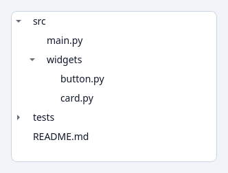
A tokenized hierarchical tree.
Built on QTreeWidget with a convenient nested setItems() API and tokenized styling (selection, hover, branches). variant/sizeVariant.
At a glance
| Tier | Free (GPLv3) |
| Import | from Custom_Widgets.QCustomTreeWidget import QCustomTreeWidget |
| Qt Designer | Yes — drag it from the palette |
Quick start
from Custom_Widgets.QCustomTreeWidget import QCustomTreeWidget

widget = QCustomTreeWidget()
widget.setItems([
{"text": "src", "expanded": True, "children": [
    {"text": "main.py"},
    {"text": "widgets", "expanded": True, "children": [
        {"text": "button.py"}, {"text": "card.py"}]}]},
{"text": "tests", "children": [{"text": "test_button.py"}]},
{"text": "README.md"},
])
That is the exact code behind the screenshot above.
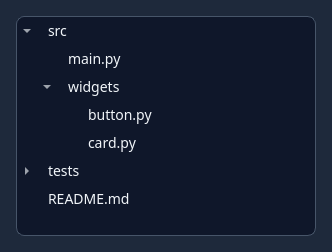
Dark theme
Colours come from the design tokens, so the widget follows the app theme with no extra work.
Properties
Every property below is settable in code and in Qt Designer.
| Property | Type | Default |
|---|---|---|
frameShape | QFrame::Shape | — |
frameShadow | QFrame::Shadow | — |
lineWidth | int | — |
midLineWidth | int | — |
frameWidth | int | — |
frameRect | QRect | — |
verticalScrollBarPolicy | Qt::ScrollBarPolicy | — |
horizontalScrollBarPolicy | Qt::ScrollBarPolicy | — |
sizeAdjustPolicy | QAbstractScrollArea::SizeAdjustPolicy | — |
autoScroll | bool | — |
autoScrollMargin | int | — |
editTriggers | QFlags<QAbstractItemView::EditTrigger> | — |
tabKeyNavigation | bool | — |
showDropIndicator | bool | — |
dragEnabled | bool | — |
dragDropOverwriteMode | bool | — |
dragDropMode | QAbstractItemView::DragDropMode | — |
defaultDropAction | Qt::DropAction | — |
alternatingRowColors | bool | — |
selectionMode | QAbstractItemView::SelectionMode | — |
selectionBehavior | QAbstractItemView::SelectionBehavior | — |
iconSize | QSize | — |
textElideMode | Qt::TextElideMode | — |
verticalScrollMode | QAbstractItemView::ScrollMode | — |
horizontalScrollMode | QAbstractItemView::ScrollMode | — |
updateThreshold | int | — |
keyboardSearchFlags | QFlags<Qt::MatchFlag> | — |
autoExpandDelay | int | — |
indentation | int | — |
rootIsDecorated | bool | — |
uniformRowHeights | bool | — |
itemsExpandable | bool | — |
sortingEnabled | bool | — |
animated | bool | — |
allColumnsShowFocus | bool | — |
wordWrap | bool | — |
headerHidden | bool | — |
expandsOnDoubleClick | bool | — |
columnCount | int | — |
topLevelItemCount | int | — |
supportedDragActions | QFlags<Qt::DropAction> | — |
variant | enum: primary/secondary/outline/ghost`` | outline |
sizeVariant | enum: sm/md/lg`` | md |
Methods
| Method | Description |
|---|---|
setItems(items, headers=None) | Build the tree from nested data. Each item is a string, or a dict |
sizeVariant(*args, **kwargs) | Size variant. |
variant(*args, **kwargs) | Variant. |
Theming
Colours come from the design tokens, so they follow the active theme. Roles used: surface, on-surface, surface-muted, outline, accent, on-primary.
See Design tokens.
Related
QCustomCodeEditor · QCustomDataTable · QCustomNodeGraph · QCustomRichTextEditor · QCustomTableToolbar