QCustomToast
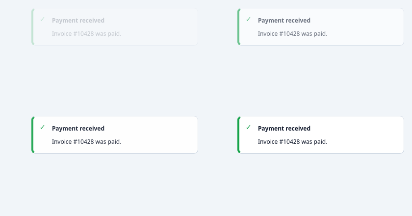
Non-blocking, auto-dismissing, corner-stacked
notifications (success / error / warning / info).
Unlike QCustomModals, toasts STACK in a corner and reflow as they close, managed by QCustomToastManager. Styled entirely from design tokens (see Custom_Widgets/theming/tokens.py); no bundled assets.
QCustomToast.success(window, "Saved!") QCustomToast.error(window, "Failed", title="Upload", position="bottom-right")
At a glance
| Tier | Free (GPLv3) |
| Import | from Custom_Widgets.QCustomToast import QCustomToast |
| Qt Designer | Code only |
Quick start
from Custom_Widgets.QCustomToast import QCustomToast

widget = QCustomToast()
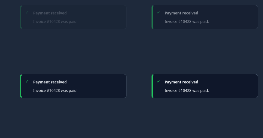
Dark theme
Colours come from the design tokens, so the widget follows the app theme with no extra work.
Properties
Every property below is settable in code and in Qt Designer.
| Property | Type | Default |
|---|---|---|
variant | enum: success/error/warning/info`` | info |
Signals
| Signal |
|---|
closed() |
Methods
| Method | Description |
|---|---|
closed(...) | Closed. |
dismiss() | Dismiss. |
showToast() | Show the toast. |
variant(*args, **kwargs) | Variant. |
Theming
Colours come from the design tokens, so they follow the active theme. Roles used: surface, on-surface, surface-muted, outline, success, destructive, warning, info.
See Design tokens.
Runnable example
A complete app using this widget lives at examples/PySide6/QCustomToast/main.py.
Related
QCustomAgendaList · QCustomAlert · QCustomAvatar · QCustomAvatarGroup · QCustomBadge · QCustomCard · QCustomChip · QCustomChipGroup