QCustomPopover
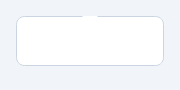
A rich popover anchored to a widget.
Unlike a text tooltip, a popover holds arbitrary widgets and points at its anchor with an arrow. Opens on demand (or wire it to a trigger via attach()); closes on outside click. Tokenized colours via qproperty.
At a glance
| Tier | Free (GPLv3) |
| Import | from Custom_Widgets.QCustomPopover import QCustomPopover |
| Qt Designer | Code only |
Quick start
from Custom_Widgets.QCustomPopover import QCustomPopover

widget = QCustomPopover()
Dark theme
Colours come from the design tokens, so the widget follows the app theme with no extra work.

Properties
Every property below is settable in code and in Qt Designer.
| Property | Type | Default |
|---|---|---|
panelColor | color | — |
borderColor | color | — |
Signals
| Signal |
|---|
closed() |
opened() |
Methods
| Method | Description |
|---|---|
addWidget(widget) | Add a widget. |
attach(trigger, placement='bottom') | Create a popover anchored to trigger and open it on click. |
borderColor(*args, **kwargs) | Border color. |
closed(...) | Closed. |
contentLayout() | Content layout. |
opened(...) | Opened. |
panelColor(*args, **kwargs) | Panel color. |
setPlacement(placement) | Set the placement. |
showPopover() | Show the popover. |
Theming
Colours come from the design tokens, so they follow the active theme. Roles used: surface, on-surface, outline.
See Design tokens.
Related
QCustomAccordion · QCustomCardStack · QCustomCarousel · QCustomComponent · QCustomComponentContainer · QCustomComponentLoader · QCustomEmbeddedWindow · QCustomFlowLayout