QCustomModal
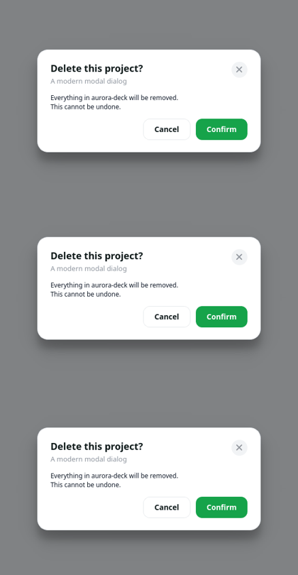
A modern centered modal dialog with a dim backdrop.
Overlays its parent window with a translucent scrim and a centered rounded card (title + close, a content slot, and action buttons). Click the scrim or the close button, or press Esc, to dismiss. Show it with showModal(); it animates in. Emits triggered(key) for action buttons and closed() on dismiss. Theme from code with applyColors(...).
m = QCustomModal(mainWindow) m.setTitle("Send money"); m.addContent(myForm) m.addAction("Cancel", "cancel"); m.addAction("Send", "send", primary=True) m.triggered.connect(handler); m.showModal()
At a glance
| Tier | Free (GPLv3) |
| Import | from Custom_Widgets.QCustomModal import QCustomModal |
| Qt Designer | Yes — drag it from the palette |
Quick start
from Custom_Widgets.QCustomModal import QCustomModal

widget = QCustomModal()
Dark theme
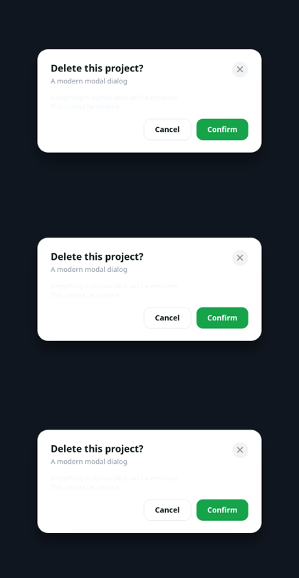
Colours come from the design tokens, so the widget follows the app theme with no extra work.
Properties
Every property below is settable in code and in Qt Designer.
| Property | Type | Default |
|---|---|---|
title | string | Modal title |
subtitle | string | — |
cornerRadius | int | 20 |
panelWidth | int | 420 |
scrimAlpha | int | 120 |
closeOnScrim | bool | True |
xColor | color | — |
Signals
| Signal |
|---|
closed() |
triggered(QString) |
Methods
| Method | Description |
|---|---|
addAction(text, key=None, primary=False, danger=False) | Add an action. |
addContent(widget) | Add a content. |
applyColors(bg=None, text=None, muted=None, border=None, accent=None, accentText=None, hover=None) | Apply the colors. |
clearActions() | Clear the actions. |
clearContent() | Clear the content. |
closeModal() | Close the modal. |
closeOnScrim(*args, **kwargs) | Close the on scrim. |
closed(...) | Closed. |
cornerRadius(*args, **kwargs) | Corner radius. |
eventFilter(obj, ev) | Event filter. |
panelWidth(*args, **kwargs) | Panel width. |
scrimAlpha(*args, **kwargs) | Scrim alpha. |
setSubtitle(text) | Set the subtitle. |
setTitle(text) | Set the title. |
showModal() | Show the modal. |
subtitle(*args, **kwargs) | Subtitle. |
title(*args, **kwargs) | Title. |
triggered(...) | Triggered. |
xColor(*args, **kwargs) | X color. |
Related
QCustomAccordion · QCustomCardStack · QCustomCarousel · QCustomComponent · QCustomComponentContainer · QCustomComponentLoader · QCustomEmbeddedWindow · QCustomFlowLayout