QCustomSparklesText
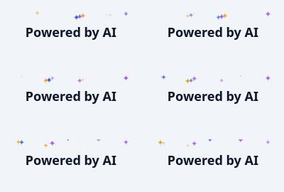
Text with drifting sparkle particles.
The "magic"/AI accent: small four-point stars twinkling around a headline.
The particles are DETERMINISTIC given a seed. That is deliberate: a random sparkle field cannot be tested, cannot be screenshotted reproducibly, and makes two runs of the same demo look different for no reason. Seeded, the motion is still organic but the widget is verifiable.
Stars are painted as real polygons, not a unicode glyph - the design lint rejects glyph icons, and a real polygon scales and tints properly.
Animation stops while hidden, like QCustomRainbowButton.
At a glance
| Tier | Free (GPLv3) |
| Import | from Custom_Widgets.QCustomSparklesText import QCustomSparklesText |
| Qt Designer | Yes — drag it from the palette |
Quick start
from Custom_Widgets.QCustomSparklesText import QCustomSparklesText

widget = QCustomSparklesText()
Dark theme
Colours come from the design tokens, so the widget follows the app theme with no extra work.

Properties
Every property below is settable in code and in Qt Designer.
| Property | Type | Default |
|---|---|---|
text | string | — |
sparkleCount | int | 14 |
sparkleSize | float | 7.0 |
speed | int | 60 |
animated | bool | True |
seed | int | 7 |
fontScale | float | 1.5 |
bold | bool | True |
colorsCsv | string | #f59e0b,#a855f7,#2563eb |
textColor | color | #0f172a |
Signals
| Signal |
|---|
clicked() |
Methods
| Method | Description |
|---|---|
animated(*args, **kwargs) | Animated. |
bold(*args, **kwargs) | Bold. |
clicked(...) | Clicked. |
colors() | Colors. |
colorsCsv(*args, **kwargs) | Colors csv. |
fontScale(*args, **kwargs) | Font scale. |
isAnimating() | Return whether the widget is animating. |
seed(*args, **kwargs) | Seed. |
setColors(colors) | Set the colors. |
sparkleCount(*args, **kwargs) | Sparkle count. |
sparkleSize(*args, **kwargs) | Sparkle size. |
sparkles() | [(x, y, size, opacity, colour), ...] for the current phase. |
speed(*args, **kwargs) | Speed. |
start() | Start. |
stop() | Stop. |
text(*args, **kwargs) | Text. |
textColor(*args, **kwargs) | Text color. |
Theming
Colours come from the design tokens, so they follow the active theme. Roles used: on-surface.
See Design tokens.
Runnable example
A complete app using this widget lives at examples/PySide6/QCustomSparklesText/main.py.
Related
QCustomAgendaList · QCustomAlert · QCustomAvatar · QCustomAvatarGroup · QCustomBadge · QCustomCard · QCustomChip · QCustomChipGroup